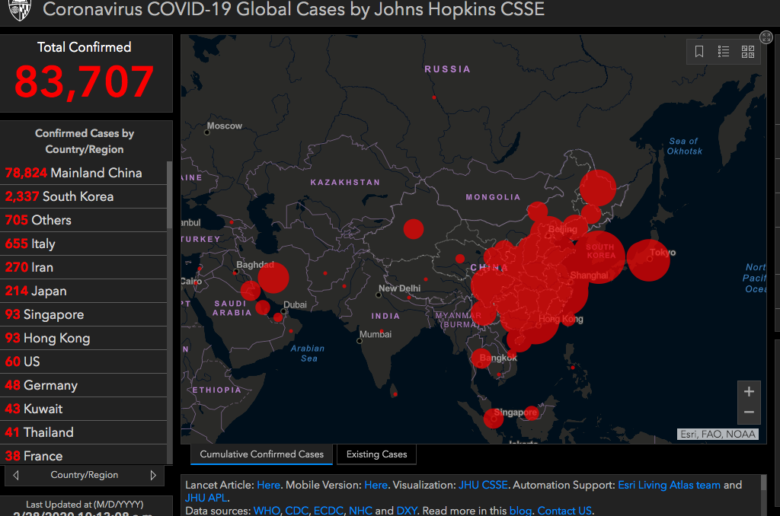
Coronavirus: An Interactive Map Shows The Spread Of The Infection Real-Time

The coronavirus keeps the world in suspense, even though, according to experts, it is less dangerous than influenza (the flu). Nevertheless, the virus is responsible for the death of over 2000 people already, and over 80K are infected. The disease is gradually spreading around the world and causing panic everywhere. In Europe, most of the cases have been registered in Italy, followed by Germany, and France.
Interactive map
It is not surprising that people want to stay informed, especially in times of advanced digitalization. So, what do you do to visualize the spread of the disease? An interactive map, of course.
One such was published last month by the Johns Hopkins Whiting School of Engineering, a department of Johns Hopkins University in Baltimore, Maryland. The data is based on information from the World Healthcare Organization, the Centers for Disease Control and Prevention, the Health Emergency Office in China, and DXY, a Chinese online community for physicists, medical professionals and pharmacists.
“DXY is a Chinese website that aggregates NHC and local CCDC situation reports in near real-time and provides more up-to-date regional case estimates than the national reporting organizations are capable of,” the university said.
All data open
The team behind the interactive map is tracking the COVID-19 spread in real-time and their data is available for download. The dashboard aims to provide an understanding of the outbreak situation with transparent data sources.
In any case, thanks to the map, one can see where exactly there are registered cases. For instance, the first infected person in Romania is close to a town called Fagaras, which is over 200 km north of the capital city Bucharest. There is also one case in Greece and one in Macedonia, both of them far from the capital cities. In Bulgaria, there are still no recorded cases.


