Developing software with accessible UI: On a journey to inclusivity with Documaster

According to the World Health Organization, about 15% of the world’s population live with some sort of disability. That’s about 1 billion people who might be unable to experience a piece of standard software. And, in 2021, given the global pandemic, it’s an even more important topic as many people have to do almost everything online.
“I’ve always been curious about how people with disabilities use websites – it turned out it is quite difficult, especially in Bulgaria there are still very few tech companies that pay attention to accessibility,” tells us Silvia Tzeneva, front-end developer at Documaster.
Documaster is currently on a journey to revamp the user interface (UI) of its products and in the process, the company aims to make sure that it’s more inclusive about its customers. That’s an interesting task as it requires a change in mindset and lots of new learnings. Everyone on the team has had to gain awareness of the importance and specifics of making software accessible.
Accessible design 1.0.1
Especially for the blind or visually impaired, screen readers are essential devices as they convert what’s on a computer screen into a synthetic speech or braille output. The user would normally use the keyboard or another device to go through the interactive elements on the page — for example, links, buttons, text input fields, etc. Of course, this requires that software is designed and coded in a simple to navigate manner. There are many ways this can go wrong – bad and complex hierarchy, missing ‘alt’ tags on images, ambiguous link descriptions, and so on.
Similar to most design projects, accessibility also starts with excellent understanding and empathy for the user. “At the very beginning, we thought that people with reduced sight use the Tab key to explore the links on a page but according to recent research they’d first navigate through the headings in order to find information of interest,” shares Silvia.
“I am very proud that Documaster hired a QA with impaired vision. People with disabilities are capable of being excellent IT professionals, they just need to be provided with the right environment. And when I’m working closely with such a person, I can see first-hand what their difficulties are” she adds.
On the technology side, there are multiple things designers, developers, and QAs should keep in mind – from the careful and strategic use of semantic HTML, section elements, and headings through intuitive and predictable keyboard focus order all the way to clear labeling and button CTAs. At the end of the day, you don’t want the screen reader to mention the presence of every div tag on the page or describe images as fgdhfdhf.png.
“Sometimes it’s a challenge to reject a beautiful design that many customers would love, but would exclude others. We need to find the balance between simplicity and visual appeal,” explains Silvia.
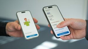
Example demo of what software accessibility means in practice for Documaster’s public portal © Documaster
Beyond the software
The new and more accessible UI design in Documaster’s products will be finalized later this year. Besides the social aspect, this inclusivity will also help the team apply for projects for the public sector and have more people benefit from the added value of Documaster’s records and document management solutions.
Developing accessible software appears to have a couple of other positive impacts.
“It is very inspiring to build software with a social aspect, not one that only makes money. When you start working on accessibility, you become more aware of (the lack of) inclusivity in other areas. For example, many schools in Bulgaria still do not have elevators, and children in wheelchairs have no easy way to move around, same with many sidewalks, so you start thinking about what needs to happen for things to improve in these areas of life as well,” says Silvia.


